

Presto Digital — Brand Identity & Visual System
Institutionally Fluent: Brand Identity for the New Crypto Market
Presto Digital is an institutional digital asset firm spun off from Presto Labs' Sales & Trading team. Built to operate at the intersection of crypto-native markets and traditional finance, the organization needed a brand foundation capable of establishing trust and opening doors in institutional sales from the very first touchpoint. Starting from brand strategy, I defined Neutral Futurism × Functional Minimalism as the core visual language, and translated it into a cohesive system spanning color, typography, interactive motion graphics, and the full web experience. Designed to perform where it matters most: in the field.
Role & Scope
Led the end-to-end brand process, from strategic positioning and visual identity to graphic production and motion design. Collaborated with an external product design partner for website development, taking on the Creative Direction role to ensure the brand language was implemented consistently across the full product experience.
Strategic Challenge
The central challenge was defining a new visual positioning from scratch. Leaning too far into crypto-native aesthetics would undermine credibility with institutional partners; adopting the rigid visual grammar of traditional finance would obscure the firm's agility and technical edge. The brief, in essence, was to find and hold the ground between the two.
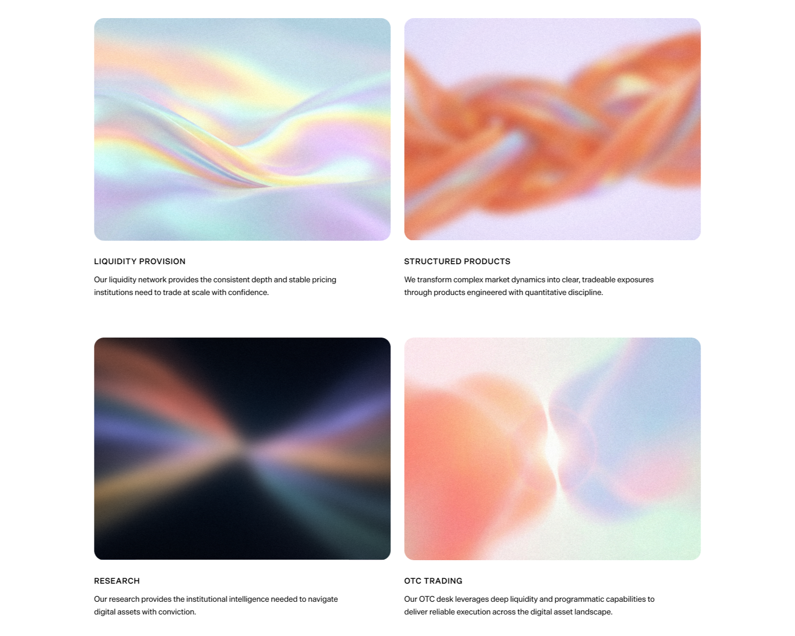
The chosen direction, Neutral Futurism × Functional Minimalism, introduced a second layer of tension. Applied without restraint, this language risks becoming toneless: polished, but without conviction. Presto Digital's quantitative depth and precision execution could easily disappear behind the surface. The solution was the service diagram system, a set of abstract motion graphics each mapped to a specific service, legible to anyone fluent in the space without ever becoming literal. The continuous wave of liquidity, the tangled mesh of structured complexity, the convergence of a large block trade. Communicating expertise through form rather than explanation.


Design Direction
Rather than foregrounding technical capability, the priority was trust and experience first. At this position in the market, between institutional and crypto, the brand needs to read as a credible counterparty before a single word is exchanged. Overloading the visual language with signals of technical sophistication creates distance rather than confidence. The decision to work with abstract, sensory visuals was a deliberate strategic call, not an aesthetic one.
System Details
Color
Presto's existing brand orange was retained as an anchor, then blended with steel blue to shift the overall tone toward a more neutral, institutionally legible position. The resulting gradient system, two colors merging organically rather than sitting in opposition, becomes the brand's primary graphic language, carrying the positioning logic directly into the visual surface.
Typography
Die Grotesk by Klim Type Foundry was selected as the primary typeface. The criteria: Clean, Minimal, Versatile, Legible, Subtle Edge. Neutral enough to carry institutional weight, distinct enough to hold character. Shaped in the long shadow of Helvetica, Die Grotesk sits precisely between full neutrality and assertive personality. Rooted in modernist structure, refined through the study of original metal cuts, it brings a quiet tension to the typographic system. Exactly the register Presto Digital needed.
Components & Motion
The component system was built around abstraction: gradient forms, fluid motion, and tactile visual textures designed to be felt as much as read. This was a direct expression of the brand's strategic position, prioritizing trust and experience over a demonstration of technical capability. Holographic 3D objects, organically shifting gradients, and interactive service diagrams were all developed within this framework. A visual vocabulary that signals sophistication without explaining itself.
Outcome
The firm is currently in pre-launch, with the website and company introduction materials prepared for rollout. The objective of this project was to deliver a brand system ready to perform in institutional sales contexts from day one: a complete visual identity, a functioning web presence, and a suite of communication assets. That foundation is in place.